Okay, here’s the introduction/caveat. I was writing a thing based on a simple question: can you abbreviate a 5E stat block enough to make it possible to include monster stats inline in the adventure text. The answer is yes. And I did that at the end. You can skip ahead to it. Because something bigger came out of this. I’ve always promised that I wouldn’t ask people to read a rant about a problem without offering a potential solution. But, the other side of that is that I won’t just throw up an idea or a solution without thinking through that idea. And that’s why this article got so big and so complicated. And that’s also why, ultimately, I put the minotaur on it. Because this article is mostly just Random Bulls$&%. It’s me looking at a specific design problem and nitpicking the hell out of it. And then looking at the historical way it’s been handled. But I think there’s a big problem underlying my analysis. Hence my conclusion at the end, after I rant and rage and nitpick and after I say “okay, here’s a quick and dirty way to abbreviate a stat block.” I was going to chop out huge portions of this and leave the ideas unsaid and unanalyzed, but I can’t bring myself to do it. I mean, I did edit it down. I always edit my stuff down. I cut out a lot of crap. But I couldn’t leave the main analysis out: the idea of user interface design in RPGs.
So, if you want the tl;dr version: skip down to a quick and dirty bit about how to abbreviate a monster stat block. And then maybe check the conclusion that follows to see whether it’s worth reading the rest of the post. And if you find this ranting, rambling, boring, and pointless? Don’t worry, next week is the next thing about building adventures. I wouldn’t have even bothered with this if there wasn’t an extra Wednesday in September.
By the way, you should conider that Minotaur/Random Bulls$&% designation a warning label in the future.
I want to talk about video games, players, GMs, and Wizards of the Coast. No, I’m not talking about Sword Coast Legends. I have zero f$&%s to give about yet another generic computer action RPG, even if it does claim to give me the power to run games for my friends. I can already run games for my friends. Without the limits imposed by a computer program. It’s called motherf$&%ing D&D. Especially after I take a look at the preorder page and see things like map packs and specific monsters for DM use being sold separately. At least with my D&D books, I can just draw my own maps and make my own monsters. And I never have to worry about server maintenance, lag, connection problems, and live in fear of the day the game is no longer profitable enough so they just shut down the f$&%ing servers altogether.
By the way, that last paragraph is specifically for those who have asked me if I have checked out Sword Coast Legends. I didn’t include it specifically to s$&% on SCL. If you’re into that bulls$&%, fine and dandy. I don’t care. Stop asking ME about it. I run role-playing games, okay? I never wanted to be a World of Warcraft admin.
But let’s talk about some other fun video games. For example, let’s talk about Mass Effect. The first one. Great game, right? Good story. It tricked you into thinking your decisions mattered. It had well-written characters and a very well-developed universe. But the game itself was kind of hard to get into. I mean, I actually gave up on it because of the gameplay. And a lot of people who loved it flat-out admitted they loved it in spite of the gameplay. And one of the biggest problems with the gameplay was the UI.
UI. User Interface. If you’re not well-versed in video game terms – and don’t worry, I’m bringing it back to RPGs shortly, so just try to hold out – UI refers to all of the various elements on the screen that allow you to understand what’s going on in the game and to take actions in the game. All of those menus and minimaps and hit-point bars and quest lists? Those are all UI. So are the little icons that appear over an enemy to tell you what’s going to happen when you hit a specific button. Or the exclamation point that appears to tell you when to block. Or that little box that has an icon that tells you which item you have in your hand. All of that stuff allows the user (the person playing the game) to get information from the game and also to do things within the game. Without a UI, players are running blind. And, moreover, you’re limited to however many functions you can connect to the controller that people can memorize.
Don’t get me wrong, you can do a lot with just a controller. Even a simple controller like the old Super Nintendo game pad. For example, it had four different primary buttons (not counting the digital pad used for movement) and two shoulder buttons or triggers. That gives you six functions right off the bat. But, if you also allow someone to press two buttons at a time, you can add fourteen more functions, for a total of 20. Of course, that requires the player to learn and memorize all 20 functions and button combinations. And some players do. But that’s a lot to ask of a player and any player unwilling or unable to learn all of those functions will be unable to play your game, right?
But back to Mass Effect. What was wrong with it? Well, one of the biggest problems I had with it was that the icons for all the special abilities you had were small and they made no sense. I tried to play as an engineer. So I had this holographic wrist… thing. And it could disrupt enemy shields and overload weapons and do all sorts of really neat stuff. But I couldn’t keep track of what it could do and the UI did a really bad job of giving me simple icons I could understand at a glance.
Now, that’s just one example. I could do an entire article analyzing the poor interface design in Mass Effect, but it’s a seven year old game and many other people have already written that article and I don’t write about video games. So, let’s talk about a different video game.
Let’s talk about Borderlands. Borderlands is a fun first-person shooter semi-sort-of-role-playing-game mainly about shooting midgets and space dogs with acid shotguns. I s$&% you not. And I loved the game. And the second one had great writing and fun characters, though there was something oddly off about the game play in the second way and I still can’t quite figure out why it didn’t feel as good as the first one. Doesn’t matter. In addition to the awesome gunplay that included submachine guns that shot bullets that set people on fire, there was also a lot of “gather the pants” style of play. You know what I mean. That Diablo thing where, after you finish killing all the things, you spend forever gathering up random loot from everything in the environment and comparing it to every bit of loot you’re already wearing to determine whether it is slightly better. Except that Borderlands’ inventory management and menu system was absolutely atrocious. I’m not even complaining about the aggressively limited amount of inventory space, here. I’m talking about the menu system that let you compare, sell, organize, and switch items. It was horrible.
What’s my point? Mass Effect is a good game. Borderlands is a good game. Right? People liked them. I liked them. Well, I liked Borderlands. But I don’t hold Mass Effect against anyone. It wasn’t a bad game. It wasn’t for me is all. My point is, as the smuggest of the perpetually offended crowd on the Internet are always quick to point out ad nauseum, it is possible to like a thing and yet recognize it’s more problematic elements. These games were good IN SPITE of their crappy user interfaces. You were willing to ignore the obstacles presented by the UI to keep playing the game.
And that brings us to Dungeons & Dragons. Dungeons & Dragons is a great game that offers an absolutely horrible user interface. And that user interface sucks because it seems like no one is thinking about how the end user actually interacts with the product. And I want to complain about it.
Actually, what I really want to do is reformat the way published modules present monsters (and maybe eventually other things). But I’m going to start with a rant about the user interface because, you know, bitching about the parts of game design most people take for granted or just outright ignore is kind of my thing.
What User Interface?
We don’t think of role-playing games as having a user interface. Mainly because the whole f$&%ing game is in our imagination and it plays out primarily in the form of spoken word. But when we are forced to grudgingly admit that there really is a user interface, we tend to think immediately of miniatures and battlegrids and dice. And yeah, these are interface elements. But we tend to blame those things on the GM. After all, D&D doesn’t care if we play with a battlemat or a preprinted map or with nothing but vague verbal descriptions. It doesn’t care if we use miniatures or pennies. I mean, it DOES. But no one wants to hear me say that again because nothing offends people like insisting that there is no such thing as gridless D&D 5E. There’s only D&D with an invisible grid you have to keep in your head.
But, let’s say I insist that those aren’t the interface elements I’m talking about. What’s next? Well, the character sheet is a user interface, right? It’s there to present useful information to the players so they can interact with the game. And yes, the character sheet is a perfect example of a user interface. The players – the users – rely on the character to present the information they need to play the game. But I’m also not here to critique the D&D character sheet. I mean, it’s no worse than the Pathfinder character sheet or any other RPG character sheet and it certainly isn’t any better.
Actually, you know what? Let’s talk about it for a second. Let’s talk about why the D&D character sheet is kind of a sucky design. First of all, let’s assume the goal of the character sheet is to compile all of the information necessary to play the game such that you never need to refer to the rule book. We can argue about whether that’s a fair goal or not some other time (hint: it’s not an unfair goal at all). Is there any information that doesn’t appear on the character sheet that you absolutely need to play the game? I don’t mean corner case s$&%. I mean on a regular basis.
Here’s an easy one: weapon damage type. You never know whether that is going to be needed, right? At higher levels, lots of creatures and spells have specific resistances. Hell, I can list off the top of my head five creatures that you’ll encounter before fifth level where the damage type changes how you hurt the creature. I’ll bet most GMs can. Now, in your attacks, there’s a blank for damage where you can fill in a damage code like 2d6+2. But do you have enough room to write in “bludgeoning” after that? It doesn’t quite fit in the PDF text field if you’re typing it.
And I know what you’re thinking: you abbreviate. 2d6+2B is no big deal. But my question is WHY do you have to abbreviate? And if you’re new to the game and making your first character, do you even know you should probably make a note of your damage type if you can’t remember. No. And that’s part of why you call it out on the character sheet. Because that communicates to players that the information IS important. Just by having a blank on there you tell them something about what information is important to pay attention to.
What about weapon keywords? Sure, some of them don’t matter that much, right? After all, if it’s a Finesse weapon, you just need to use the right ability score to calculate the attack and damage stats. That you do during character generation. But what about Versatile? That’s a more important one, isn’t it? If you’re using a longsword, you can switch between using it one-handed and using it two-handed to switch between 1d8 and 1d10 damage. And, if you’re reasonably tactical, you do. It’s a valuable trait. If it weren’t a valuable trait, it wouldn’t exist. D&D believes it is a valuable trait. But how do you record that on the character sheet? You kind of have to force it in there.
What about ranges for ranged weapons? And whether the weapon requires loading? Where does that s$&% go? I mean, you could argue that a player should know this stuff for the weapons they choose, but you can also argue that a video game player should be able to memorize 20 button combinations. If you make that a barrier to play, you’re excluding people unwilling and unable to devote the brain space.
But that attack/weapon thing was just a warmup. Just a minor demonstration of how the D&D character sheet wasn’t really designed for the game that actually exists. Because I am certain very little time went into designing that character sheet. In fact, I recall that there was a contest held to design to D&D character sheet. That’s how little WotC gave a s$&% about the character sheet design in the end. Let me give you the Ur example: spells.
What’s the range on a fireball? Does confusion require a material component? Is that component consumed? Is charm person a concentration spell? Is sleep a concentration spell? That’s important because it means casting one will disrupt the other. How much damage does a firebolt do? What’s the effect of passing a saving throw against a disintegration spell? Where is any of that information on the character sheet.
It isn’t there, is it? Of course it isn’t there. Because spell-based RPGs gave up on including spell record sheets. The attitude of D&D and games like it toward all the spell data is “you’re on your f$&%ing own.” Players will work it out, right? They will make notes. Or lists. Or they will just keep the PHB handy so that every f$&%ing time someone casts a spell, you have to wait for them to look it up in the book. Whatever.
Now, I’ve raised this point before and the counterarguments tend to run this. If someone wants to play a spellcaster, they should learn their spells. The spells are in the PHB, you don’t need a record sheet. Or, worst of all, the spells are too complicated for a record sheet.
Now, that first argument is the same as the “too many button combos” argument. It’s a load of horses$&%. But let’s look at those other two arguments.
It’s Too Complicated for Record Sheets
Most spells are too complex and detailed for mere record sheets, right? They can only exist as blocks of text. First of all, this is horses$&%. The vast VAST majority of spells have one or two lines of useful text and a few important stats. There is no reason at all I can’t abbreviate most spells.
Beacon of Hope Abj, 1 Act, 30’, VS, Conc 1 Min, chosen targets in range get Adv on Wis and Death saves, die rolls for healing maxed
Most spells are pretty straightforward. Straightforward enough that, with some guidance from a character sheet, I can fill in what I need. But, honestly, that’s a lot of work. Most players won’t do that s$&%. They’ll just default to looking the s$&% up in the book.
But there’s no reason why spell sheets can’t exist with all of that information abbreviated. You could get two or three levels of spells for a given class on ONE sheet with the right format. You don’t even have to sell or publish them. Make them downloadable. And give them out with pregens. Or you can sell them. Or they could exist as a tearout section in the back of the Player’s Handbook.
But, there are some spells that would require a bit more to abbreviate. I admit that. And that’s sort of where I call out the whole design as bulls$&%. Here’s the thing: if a spell is so complicated that it can’t be used at the table without stopping the game to look it up in the book, you have several choices. You can decide that it’s worth it and leave the spell in the game. Or you can decide it isn’t worth it and pull the spell out of the game. Or you can edit the spell to make it simpler. But those are design choices. It’s not an accident that a spell ends up in the game that is too complicated to easily reference or remember. A designer CHOSE to include that spell and decided that the obstacle it presents to play was worth having the spell.
But what’s really interesting is that a solid interface design makes those choices easier. If you’ve given some thought to how the information will be USED in the game and how it will be PRESENTED during the game, that will guide you to write content that fits within that design framework. Or to redesign the framework if it ends up limiting too many things. That’s how the design should work. The interface, the way people use and play your game, should be as much a part of the design as any other aspect of the game.
And THAT is where I take issue with D&D. I don’t get the feeling that any thought at all went into how the information was going to be used at the table. Or away from the table for that matter. After all, playing the game is only one quarter of the game. Running the game is another quarter. Designing adventures and other content is another quarter. And building characters is another quarter of the game. And the books for the game have to be useful for ALL FOUR modes of engagement.
Which brings me around to the other argument.
You Don’t Need a Sheet if You Have the Rulebook
Now, every player and GM already knows that statement is a load of complete bulls$&%. No GM likes sitting around waiting for someone to find an answer in a rulebook. No player likes sitting around waiting for another player to look up their spells even though every player conveniently forgets how much the others hate it when THEY have to look up a spell. And no GM I’ve ever met enjoys having to have three different hardback books in front of them to run a game and to flip pages back and forth looking for stats in the middle of a combat. Not one. No one – player or GM – will argue that playing the game should require referencing the rulebooks.
And yet, despite the fact that WE all know that – the users of D&D – why the f$&% don’t the designers seem to know it? Or the designers of Pathfinder? Or many, MANY other RPGs. Just because a game is crunchy and mechanically heavy doesn’t mean it can’t be designed to maximize the user experience. Want a perfect example? Hackmaster by Kenzer and Co., the new one, the one that isn’t just a joke. It’s an intricate, complicated game with many different subsystems. But, I’ll tell you it does a really good job of presenting a solid user experience. The character sheets are really well designed. I mean, it isn’t perfect. It still falls apart with spellcasting, just like every other f$&%ing RPG, but it’s much closer to a good experience than a bad one.
But the D&D designers decided either consciously or by not thinking about it that it’s okay for any spellcasting class to have to go digging through the rulebook every time they cast a spell. They decided that was part of the experience of D&D. They decided complicated spells were worth it. And they decided not to give any thought to how the spells could be presented.
But the problem could have been mitigated. See, the thing is, if the PHB made it really easy to find things, it wouldn’t be so bad. But every time I have to look something up in the PHB or the DMG or the MM, I end up flipping a lot of paper. Why? Because the page numbers are small. Because they are missing from some pages. Because there are no signifiers on the pages telling me what chapter I’m in. Because the book isn’t broken down into sections that are visually distinct in any way. For comparison, look at the D&D 3.5 core rulebook. That wasn’t perfect, but notice that on every page the page number is big and obvious at a glance. And every page has a big callout that says “Chapter 11: Spells.” Open any page of that book and you know where you are in that book. There is also both a glossary and a solid, well-organized index.
The Monster Manual is similarly a pain in the a$&. Sure, it’s alphabetical, except for the weird collection of beasts that are in their own section at the back which seems to be “normal animals” except that it also includes giant animals and a few made up things like quippers. I can’t quite spot the pattern. All I know is that giant lizard is neither under G nor L, it’s in the appendix. Why? Who the f$&% knows. Also, it’s only alphabetical most of the time.
For example, pit fiend is D. Why? Because it’s a type of devil. Or demon. Whatever. Doesn’t matter. That’s fine and dandy, but if I open the book randomly, and I end up on one of those weird creatures that doesn’t fit in the alphabetical order, it takes me an extra second to figure out what letter I’m in and whether I need to go forward or backward. Most people, when they are looking for something in a book, open to the middle. It’s called a binary search. It’s a force of habit. We open to the middle, see where we’re at, move forward or backward, and then look again.
If the book’s sections, in this case, the letters of the alphabet, were visually distinct, it’d be easier. Especially because different pages have slightly different layouts. The art is in different spots, sometimes there are no page numbers, so pages are completely devoid of stat blocks and are just blocks of text describing a monster that comes on the next page or the page before. Which means you don’t even a giant monster name staring at you to tell you you’re in the “dragons.”
The Dungeon Master’s Guide is a complete and utter mess. Not only are the sections of the book not visually distinct at all, they also don’t appear to be arranged in any logical order. Worldbuilding comes first. Then adventure building and encounter design. Then there’s magic items. And then we wander back to content design. Monster design. More world building stuff. More adventure building stuff. And there are two or three different chapters filled with advice about how to run the game. And the magic item section is arranged alphabetically. Completely alphabetically. There are no subsections, no headers, no distinctions, no logical groupings. If you don’t already know the exact name of the item you’re looking for, you’re not going to find it without reading every page. And the name is the only way to look. You can’t go looking for magical weapons or magical armor or magical potions or whatever. It’s all just lumped together in one list.
I write A LOT of my own content. F$&%, I pretty much don’t run published adventures at all. So I reference the DMG a lot. I need the encounter building charts and the magic item lists and all that other crap. I spend a lot of time in that book. And I spend half of that time flipping around trying to remember where in the book the thing I’m looking for actually is. And the index is s$&%.
What’s my point? Is this just a rant? Yeah, it is. I’m pissed off. Because like Borderlands and Mass Effect, I find myself fighting a bad interface just to enjoy a game I like. And it fatigues the s$&% out of me. But what can we do?
Modding and Patching
Let’s take another lesson from video games right now, apart from the one where user interface matters but we don’t realize how much it matters until we have to deal with a bad one. Let’s take one aspect of the s$&% design and write a mod. Or a patch. Let’s look at a different way of organizing information. That’s the thing that keeps this from being just a rant, by the way. We’re actually going to analyze a design and try to make it a cleaner experience.
Let’s look at monster stat blocks. And, in so doing, let’s rethink the way monster stat blocks are done in D&D altogether. Because this is a problem that we once had actually solved. But now we’ve lost the solution.
First of all, let’s look at a monster stat block direct from the most recently published adventure, Out of the Abyss. In the first chapter, the PCs are prisoners of the drow and have to fight their way through drow and quaggoths to escape. Here’s the stat block for one of the encounter areas.
At any time, there is a 25 percent chance that 1d4 drow are in the main hall eating or entertaining themselves with dice or card games. If any drow are present, 1d4 quaggoths are also on hand, serving and cleaning.
Those are the stats you are given to run the encounter with. Now, you might notice that the information is a bit limited. For example, how many hit points does a quaggoth have? What is a drow’s armor class? How much damage does a quaggoth’s claw attack do? What modifier does a drow use for a Charisma saving throw? Do you see any of that information?
No. Because there are no statistics. Even though you absolutely WILL need this information if the PCs break in here (because the drow and the quaggoths are hostile toward escaping prisoners and the PCs will have to deal with them somehow), none of this vital information is presented. Instead, by the same logic that requires PC wizards to have a PHB on hand at all times, you, the GM have to go to the Monster Manual.
But the drow and the quaggoths have about 150 pages between them in the Monster Manual. So, unless you’re tearing pages out, you cannot have both available at a glance. And you can’t photocopy them. Permission hasn’t been given to reproduce those pages by WotC and they aren’t included in the D&D Basic Rules. There is literally no legal way to have both stat blocks in front of you at a glance while you run the adventure.
And this again shows that WotC either hasn’t given any thought to how their products are getting used at the table (the user experience) or they can’t be bothered to care. They put the information in the books, what more do you want from them?
Now, WotC has actually written about this problem before. Specifically, they wrote about this during the late 3E days when they decided to discard the “tactical encounter format.” What is that? Well, the tactical encounter format was something that WotC invented under 3rd Edition. It was a way of organizing all of the information needed to run a combat encounter on one or two pages: maps, text, stat blocks, and so on. In other words, it was a thing they did by considering the user experience and designing around providing a good one.
So why did they drop it? They dropped it because they noted that it mean every combat encounter had to take up exactly one page, exactly two pages, or exactly four pages. And that put some pretty hefty demands on page count. If you want to publish an adventure with ten encounters, that adventure was going to be ten or twenty pages just for the combats. You couldn’t run shorter adventures. And if you were just going to have the possibility of combats, you still needed a full tactical writeup. In addition, the tactical format was actually a layout. It wasn’t just a bit of running text in a document. To make it work, you couldn’t just use a general page layout. Each encounter needed its own layout design to account for stat blocks, maps, sidebars, and so on. That was a lot more work than just laying out a pile of text.
And you know what? Those are good reasons. It’s true. A product like Out of the Abyss would be hugely expensive and have a massive page count if you tried to do the tactical encounter format. I can’t fault them for it. Because people want adventure content. And I’ll tell you honestly, from ten pages of Out of the Abyss, I’ve gotten three sessions of play. Whereas, if they had used the tactical layout, I’d have gotten five encounters (because some of the page count would be eaten up by background information and other necessary text that wasn’t part of any encounter). That maybe would have filled one session.
So did WotC make a good decision? Absolutely not. They had good REASONS, but they never turned around and looked at different ways to solve the problem. It’s sort of like, they walked out and discovered their car had a flat tire. And then they said “but what can you do,” and drove to work anyway. And now, their modules are these walls of disorganized text that are really hard to run at the table.
Now, I can’t rewrite the entire f$&%ing module and I can’t force WotC to organize this s$&% better. And WotC won’t anyway. Because the game is a pretty good game and buried under the morass, their modules aren’t bad. I mean, they have some weird moments and some dull stretches, but all modules have those. On balance, the modules are more good than bad. Yeah, I said it. And that’s why I started this whole thing by discussing Borderlands and Mass Effect and not a game that was utterly ruined by it’s bad UI. D&D is a good game. It’s fun. But the UI is s$&%.
And, sadly, I get the distinct impression the bigger RPG designers are just so entrenched in copying the same old formula, they aren’t even thinking about their games in terms of interface design.
So let’s see if we can take what WotC has done with D&D and see if we can’t find a way to make it okay to cram stat blocks into the text of the adventure.
Going Back to the Roots
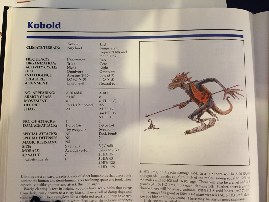
Let’s take a look back at AD&D 2E for a second. Because it did something really interesting. 1E did it too, but 2E really polished it up nice. If you look at an entry from the 2E Monstrous Compendium or Monster Manual, this is what you see:
Actually, that’s just a picture of the top of the page. There’s a bunch of text below that. But just look at the stats. By the way, that is actually from the Advanced Dungeons & Dragons Monstrous Manual from 1993, not the original AD&D 2E Monstrous Compendium, but it’s similar enough for our purposes.
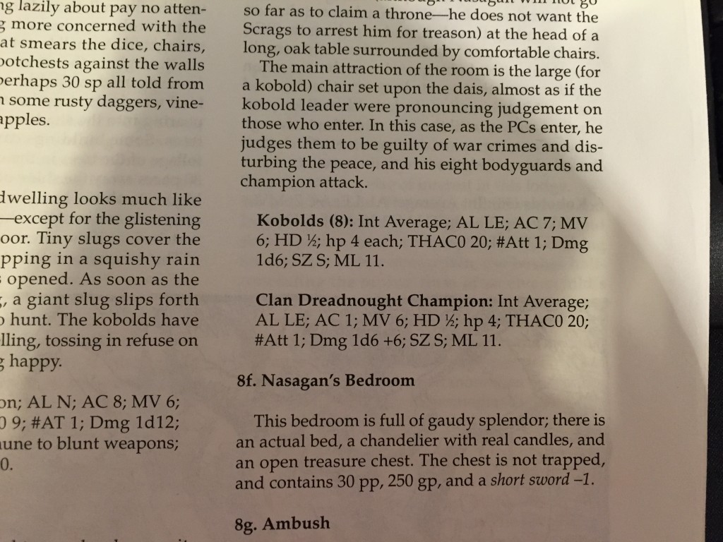
Now, let’s look at the kobold in an actual adventure. Here’s some kobolds from Dragon Mountain, a really cool super dungeon module from 1993.
Notice anything? Yeah, there’s a LOT LESS information in the adventure. Why? Because a good deal of the information about kobolds in the Monstrous Manual didn’t need to be included in the adventure. For example, all the stuff about climate, rarity, diet, treasure, and so on? That was all crap the GM used for BUILDING adventures. This adventure was already built. No reason to include that s$&% in the module. But every reason to stick it in a Monster Manual. That’s because the Monster Manual was intended for DMs to BUILD adventures from. It was a toolbox. It wasn’t meant to be referenced at the table. So it included a lot more information and it was organized with that purpose.
The stat block in the adventure was an abbreviation. It was meant just to give the GM the very basic information needed to run an encounter with that creature. Notice that it has combat stats, alignment, intelligence, and morale. Those are all the things you need to know to run an encounter with the damned things. How smart are they? How brave are they? How do they interact morally with the world? And how much of a fight can they put up?
On top of that, I’d also like to call attention to one other thing that the stat block does. It doesn’t call out default information. For example a Kobold’s AC in AD&D 2E was 7 (10). That 10 is the basic Armor Class of a naked kobold. Which is also the same basic Armor Class as any naked humanoid. So, in the stat block, it gets dropped. First of all because it’s unlikely the kobolds will end up naked. And second of all because the default AC is basic information.
3rd Edition actually started with the same basic approach. In fact, if you check your 3.5 Dungeon Master’s Guide (pp. 84 – 85), you’ll see it actually explains abbreviated stat blocks. And early 3.5 adventures used those stat blocks. So, where did they go?
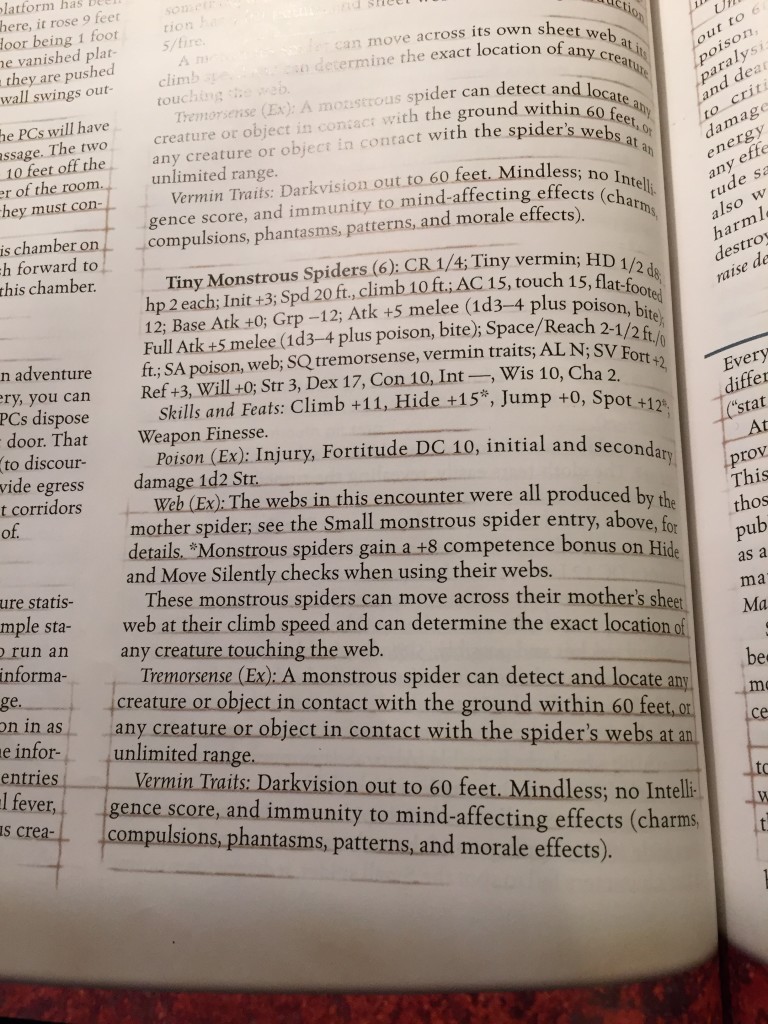
Well, the thing is, 3.5 was a more complicated creature. And one of the basic tenets of 3.5 was universal rules. Every living thing – PC or monster or NPC – had the same types of stats and followed all the same stats. That meant that the minimum amount of complexity per monster was set pretty high. Notice even the examples that the book gives on page 84 (some spiders) take up 25 lines of text. Here, take a look:
Now, notice a few things. First of all, that stat block is hard the eyes. Quick, glance at it and find the AC. Tough, huh? Yeah, it’s a big ole wall of ugly abbreviations and numbers. It’s a complete mess. Second of all, notice that the bulk of space taken up by the stat block is a complete explanation of the rules for each of the monster’s special abilities. Now, you need that s$&%. I won’t deny it. If I’m going to run spiders at the table, I need to know how their webs work. Then and there. Why? Because webs only come up once in a very rare while. It’s not something I keep in my head. Webs literally only come up when spiders are around. The spider has to bring its web rules along, unlike the kobold bringing along it’s naked 10 AC.
And so many monsters in 3E had special abilities and the rules were so detailed, that even weak, simple monsters had them. So, while 3E’s heart was in the right place when it came to user interface, it ultimately failed. And that’s why they adopted the tactical encounter format. Which, again, was a great format except for the page count and layout issues. The biggest obstacle to a good user interface in 3E was the complexity of the game itself. The monsters were designed without regard for how they would be presented. Otherwise, the special abilities would have been simpler. There would have been fewer of them. And thought would be given to formatting them as anything other than paragraphs of raw rules.
While we’re doing this tour, what about 4E? Well, 4E was a very different creature. In 4E, monsters had only the stats they needed to run at the table. The format of attacks and stats was designed around a solid user interface. Seriously. They clearly spent a lot of time thinking about how to present monsters. And, moreover, they built monsters to suit their interface. And more moreover, they also cut out extraneous words. Every power, attack, and trait was carefully culled down to the minimum number of words needed to make it functional. It should have been perfect. And honestly, 4E had a GREAT interface. For GMs. Running adventures. Except…
Except the stats blocks took up a lot of room. And the encounter design was based around having multiple creatures in one encounter and having a variety of creatures in each encounter to fill different roles. Remember that? An encounter should have about as many monsters as PCs and at least two or three roles should be filled. Check your 4E DMG. Which meant that every encounter was going to be filled with two or three bulky stat blocks.
As a side note, though, notice that there was only one interface for monsters. Unlike AD&D 2E and 3.5, 4E did not differentiate between monster stats in the monster manual – where they were meant to be used to build encounters – and stat blocks in the adventure – where the focus was just on running the creature at the table. So, many folks complained that the Monster Manual was bland. It was soulless. It was JUST stat blocks. And it was. Moreover, the language was so built around abbreviation and shorthand that there wasn’t much room for nuance or creativity. The monster abilities were exacting, precise, and limited. 4E’s monster design, while ultimately a lot of fun, is actually a great example of what happens when you go too far in the other direction of letting the UI dictate the design.
Okay, let’s bring this back to 5E now because, ultimately, we want to do something useful. We want to present stat blocks in the text of adventures. And to do that, they need to be manageable.
5E was built to ignore the idea of a user interface. It just didn’t care. Because it was a product of 3E and 4E. From 4E, it took the idea that the stat block should mostly contain only information needed to make the monster playable. From 3E, it took the idea that monsters and PCs should play by the same rules – ability checks, proficiency bonuses, spell slots, etc. And that could have been fine because somewhere between 3E and 4E, there is a really good approach to monster user interface. But 5E didn’t bother. Notice that, when a stat block DOES appear in a 5E product, it’s identical to the stat block in the Monster Manual. There’s actually no accepted system for abbreviating. Because the stat block doesn’t contain information that isn’t needed to run the monster to begin with. But even those blocks of text that explain the special rules are full chunks of rules. They are, mercifully, pretty short and few of them are as complex as most of the abilities from 3E.
But 5E can afford to get away with big stat blocks because 5E is built in the aftermath of the death of the tactical encounter format. Once WotC stopped with the tactical encounter format, they trained us to accept references to the Monster Manual in lieu of stat blocks. A late 3E or 4E adventure could get away with just saying “there’s 3 kobolds in the room” with a page reference and maybe a hit point total. And we accepted it because we understood the argument that the tactical encounter format was cheating us out of content and making adventures prohibitively expensive to produce in print format. And even if we argue that print format was unnecessary, there was still the issue of complex layout design for every encounter.
So the designers at WotC had already solved the problem. They had trained us to accept page references and just understand we can’t run modules without a Monster Manual open next to us. And we would work out the page flipping issue. Except that isn’t actually a solution. Unless you consider “got mine, f$&% you” a solution. WotC simply passed the problem on to us. They COULD have solved it. They were designing a new edition. They could have done anything. But they didn’t. Either they chose not to or they just didn’t think about it.
Can We Abbreviate a 5E Stat Block
So, here’s the million dollar question. Can we abbreviate a 5E stat block? Can we shrink it enough to fit it inline with the text. Or at least, for our personal use, can we shrink it enough to make it quick work to type up and jam ten of them on a page so we can have all of our monsters handy on one or two sheets?
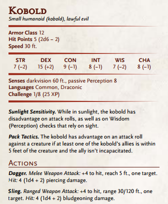
Let’s start with a simple monster and see what we can do. Let’s start with the kobold stat block.
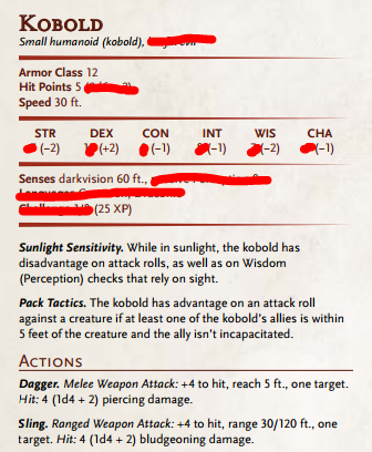
And the first thing I’m going to do is cross out all the information I rarely need when I’m running the monster at the table. Here we go.
Alignment? I don’t need it. Some people might want it. I can understand that. But alignment is now such a minimal part of the game that I feel safe ignoring it. Actually, that’s not quite true. We’re going to come back to it. But for now, we’re giving it the axe.
The dice code for HP? Needless. I just need the actual HP. Ability scores? No. I just need the modifiers because those are used for dice checks. Passive perception? The thing is, unless the creature has a weird bonus, passive perception is always 10 plus the Wisdom modifier. And I already have the Wisdom modifier. Languages? Language is a pain in the a$& in RPGs anyway. But most creatures that have language speak common and their own racial language. It rarely matters beyond that, so I feel like I can get rid of that. What about the Challenge s$&%? Well, I can cut that out. That’s for encounter building. I need the XP total though because I use that to give out XP at the game.
Now, let’s skip the traits for a second and look down at the attacks. Because here’s where the power of the default shines through. Most melee weapon attacks have a reach of 5 feet. And most attacks hit one target. Frankly, as a GM, the only time I pay attention to range and number of targets is when it isn’t “one adjacent target.” It’s such a powerful assumption that melee attacks require you to be adjacent and attacks hit one creature that you only NEED to call them out when things are different. In theory, most attacks should fit on one line, especially if we use clever abbreviation.
And that brings us around to the traits. Now, as I noted, the traits are already pretty economical in terms of word count. But let’s remember that a stat block at the table only needs to remind a GM of the rules, it doesn’t need to spell out every single word. If there’s a rare argument, the GM can make a judgment call or choose to look up the full text. We don’t want to prevent the GM from ever having to refer to a book. Wisdom (Peception) is a handy callout, but that’s also covered with the character sheet. We can just refer directly to Perception, for example. Or Stealth. Advantage and disadvantage are such ubiquitous mechanics that we can abbreviate even those words. And if we’re willing to trust a GM to understand the spirit of a thing, we can cut out some of the more niggling conditionals and corner cases. Yes, I agree that an ally that’s incapacitated shouldn’t grant advantage due to pack tactics, but we can trust most GMs to work that out and if an argument erupts, they can refer to the book. We can cut out that little bit.
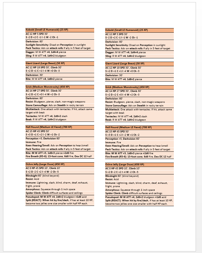
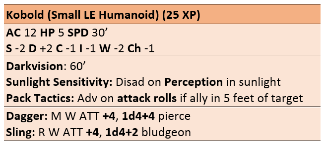
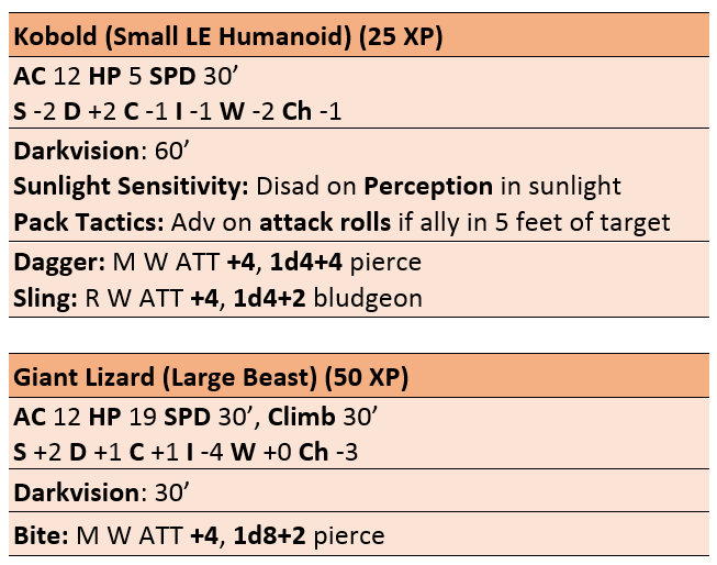
In the end, we can get 21 lines of kobold stat block down to 8. At least, I can. And that’s 8 lines in a single column on a 2 column page. I can shading and bold text to call out important bits and draw the eye. Now, I realize it’s not great. I’m not a graphic designer. But I can certainly run a kobold from this:
And hell, if the kobolds have a giant lizard friend, that’s only 13 lines of text:
I can certainly shove that inline with the text for my encounter areas without a problem. I could probably cram four encounters on a single page assuming I give each encounter several paragraphs of text. No complex layout design needed and it doesn’t take up huge chunks of page real estate. Take a look at some other conversions.
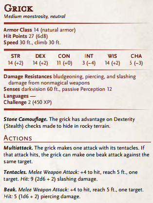
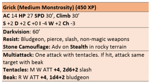
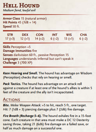
More complicated creatures require more space. And I’ll show off a few other creatures I’ve done just so you can see my pattern. Notice, by the way, that I do call out the alignment of creatures that HAVE alignments. But beasts and unaligned creatures? No reason to call it out.
And, if all you want to do is create a reference sheet for an adventure that you can keep handy, well, have a gander at this simply document that manages to cram ten runnable monsters on one page. That’s EASY to keep at hand on the table, isn’t it? And hell, I probably could have crammed another two beasts on that page.
What’s the Point?
I realize this is a long, LONG article. And I covered a lot of ground just to get to the point of saying “what if we abbreviate stat blocks?” But the truth is, I think it’s about more than that. I love D&D, but I’m very upset about the poor user experience with 5th Edition. And I think there’s an important lesson in all of this. And that lesson is: there’s more to making an RPG than designing mechanics.
We tend to focus on the game system, by which I mean both the fluff and the crunch. And we have gotten away with that for a long time because we approach everything from the perspective of someone who’s already a gamer. A while ago I ranted that the omission of an encounter building index from the 5E Monster Manual was inexcusable, that it showed a poor understanding of the way people would use the product (sound familiar). The response I got from fans was “you can do it yourself” or “someone already made one you can download” or “shut the f$&% up, who cares?” The response from WotC was actually “we didn’t think it was a big deal, we stuck it in the DMG, but fine, have one you can download.” Honestly, it’s the fan response that bothers me.
I’ve written numerous things about how we can grow the community and why the pace of growth of the RPG community is limited by the size of the RPG community. And I think part of the problem is that these games are fundamentally unapproachable unless you have someone who is already a gamer to teach you. And those fan responses show that we’re okay with that, as a community. We’re okay with barriers to entry. Well, I’m not. And I want more people NOT to be. Because 5E is a good game, but we’re settling for a bad experience and doing more work than we have to. And that’s only going to make it easier for WotC to continue to ignore the play experience.


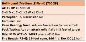

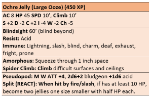
For ADnD 2e they released a version of the Monstrous Compendium that was a folder with sheets that had one creature on each side (or sometimes one creature on both sides, if there was a lot of text). I really liked that, because I could just put the sheets I was gonna need to the top and if I needed multiple creatures I could just put the sheets on top of each other so I could read the stats.
Maybe, if I’m really bored one day, I’ll make index cards with the monsters I use often – but I’d pay to have those made for me by WotC, too!
Howabout spellcasting monsters? Do you list out the spells they have prepared and the available slots? Or just list the spells they’re going to use and the number of times they can use them?
This is a really good demonstration of design not considering how it is used at the table. Personally, when I run spell-casting monsters I just give them a mana pool and have each spell they have cost 1 mana point. Who has time to track exactly how many slots a wizard has?
I actually do have my own approach, which is the second of my two descriptions above. For big fights, I usually write out a planned sequence, not literally round-by-round but more like, “first, he does this, then he does that. Then he casts X if he takes damage, otherwise he does Y.” It’s during the writing of this that I’m paying attention to how often he should be able to cast his spells (roughly, I don’t get too stickler about it). Then when the time comes to play, I use this list as a “when in doubt” guide. Seems to work — it frontloads the cognitive effort before gameplay so I’m free to react and improvise during gameplay.
For spellcasting monsters, I’d actually choose the spells they’re likely to cast, and list them under actions, a la 4E.
The MM doesn’t use spell slots. It gives you a bunch of spells and says: these spells 3/day, these spells 1/day, etc.
Similar to player powers. The 5e monsters are mechanically quite simple, but the organisation of the 5e books is horrible to navigate.
Wrong. The 1/day and 3/day spells apply for innate spellcasting. Many monsters (ex. Liches, Nagas, Drow Mages, etc.) are x level spellcasters with the spellcasting trait, and cast cleric/wizard/etc. spells using slots just like PC’s. Refer to the Spellcasting header on pg. 9 of the MM for more info.
As someone who works in UI/UX, I wonder how much time Wizards has spent observing people try to play their game? 5e was supposedly designed in a user-centric way, but I haven’t seen much evidence of user research other than surveys. Which is about the worst type of research you can do when designing a UI. Actually, it’s pretty much the worst type of research you can do. Period. A lot of these shortcomings in the UI could’ve been ironed out in the design process by just spending some time observing groups playing the game … usability testing, in other words.
The same thing can be said about dungeon maps. They give you a map filled with key numbers that doesn’t mean anything (a dozen of them). Then, as you to read throughout the descriptions, room by room, you have to flip between large walls of text and the map left some pages behind just to get yourself a little familiar with the physical layout of the place. It wouldn’t require more than a paragraph of text on the same page of the map to give each key an actual name and a very brief overview. But apparently page flipping is now a pleasure every DM must enjoy.
Yeah it’s ridiculous they still haven’t figured out you can _write things on a map_
Your first link’s broken, by the way.
Fixed. Thanks. Forgot about an octothorp.
I’d like to see the stat block for an Octothorpe. Sounds terrifying.
Imagine this: A deck of laminated monster cards. 3×5 inches so they fit in a box for index cards. Stat block on one side, snazzy illustration on the back. Even better? Slap a dry erase coating on them and have boxes to check off recharge abilities, spells, and track HP.
I was putting together basically the same response (below) and got distracted. Hit Post and boom here’s your comment. I like the dry- or wet-erase coating idea. We use a battle mat, so wet-erase markers are on the table anyway.
Seeing as WotC love selling add-ons this should be a no-brainer for them. Great idea!
It’s still too long:
-The ability numbers could all be left in the monster manual & not reproduced. If you really need them the Monster Manual, being alphabetical is the easiest book to look things up in. Or they could be in the back of the adventure.
-“Bludgeon” and “pierce” are unnecessary. A dagger is obviously piercing damage & if you can’t remember that then theres the PHB and also have your head examined. Same with the Ms and Ws, a sling is obviously a missile weapon, how is the GM even playing D&D if they don’t know that?
Ability numbers are required for saving throws.
As for the Ms and Ws, even non-weapons can *count* as a weapon attack. A Weapon Attack is a specific keyword tied to a variety of abilities. Also, what about if the weapon is something weird like “urumi”? Who the heck knows what that is off the top of their head, whether it’s ranged or not, or what kind of damage it does? Keep in mind that this format has to be standardized to work with *every* monster, not just the ones provided.
The ability numbers are used with great frequency. First of all, PC spell casters force monsters to make saving throws that require those numbers. Second of all, there are numerous common actions that require a monster to use an ability score either to take the action or resist the action. Examples include Stealth/Perception, Grappling/Escaping, and so on. They also allow you to calculate improvised actions or recalculate armor class in the event things DO change. And no, referring to the book ISN’T an option. Again, that’s a fallback on s$&% design.
As for damage type, numerous abilities and spells that the PCs have access to refer to those types. Even at first level. Barbarians and dwarves, for example, have resistances based on damage types. No, they can’t be left off.
That third thing of: if you can’t remember this, you’re too stupid to play? That is piss-poor design. That’s putting a barrier to entry in your game. I referred to that too. The whole “twenty button combination” thing. It’s one thing to say “yeah, you should memorize a dagger or hammer,” but what about a glaive or another polearm? Does everyone have to know that? Does everyone remember shortswords are piercing and not slashing unlike longswords that are slashing but not piercing? The answer is: it’s required. And that attitude of “if you can’t remember this, you are too stupid to play” has ZERO place in my comment section. No matter how you phrase it.
I’m 100% holding to “If you can’t remember a sling is both blunt and ranged, you are too stupid to GM”.
Like: we expect a GM to be able to read, to be able to know the pointy end of the arrow is the part that goes toward the monster, etc etc.
If it’s some weird. complicated weapon? Sure. But the PHB has already explained what a sling is. It’s a rock you throw. Of course it’s ranged and of course it’s blunt.
If you start to include weapon and damage type for some entries and not others, then you break one of the fundamental rules of a good UI: consistency.
How often does the nuance between bludgeoning, piercing,slashing matter for monsters? I can’t even think of a single ability that a PC has that cares.
There is zero reason to have consistency here.
If a rock doesn’t say bludgeoning but a Kukhri says piercing (or slashing or whatever)
absolutely
nothing
at
all
is affected. This isn’t a computer program–it’s a book or a printout and you’re trying to fit stuff on it.
I’m inclined to agree with this actually.
Shorthand – the note taking method – actually misses out a lot of information so that you can read between the lines and save time. You’re still going to end up with redundant information if you’re strict about the data that goes into the stat block.
Rather than straight up replacing the stat block, a system that’s flexible enough to let you state the bare bones for this situation is going to be better.
In my games languages are pretty important. It’s the line between going in blind or knowing what the enemy is up to. It makes the players feel good about some of the choices on their character sheets. But then that makes Angry GM Quick Stat Blocks useless for my games. Flexibility is what’s needed. And yeah, I don’t think I’d need explicit information on stuff I can guess – I only want the salient details. It’s a sling, figure it out.
Sure, it’s easy for you to remember that a sling is a rock-throwing weapon. But what if someone grabbed the Starter Set and four of their friends and just sat down to play, and didn’t know that a sling was? Is it a CRIME to not be familiar with medieval weaponry? Can you name five people who own a sling?
Never confuse knowledge and intelligence. The problem is not being “too stupid” to be a DM, the problem is “didn’t memorize the book”. Expecting the table to STOP ROLEPLAYING to look up something in the book is a design failure. The WHOLE POINT of a published adventure is to provide the DM with EVERYTHING they need to run the adventure.
Of course it’s blunt. Unless, of course, you actually know something about ancient weaponry. Like that a sling *bullet* is actually pointy, and will penetrate flesh deeply enough that it needs to be cut out.
https://www.youtube.com/watch?v=IHP-aoQUhlY
Best not to rely on RPG common sense.
You’re forgetting that Angry is also wanting to help newbies (such as myself) get into the game. Not everyone has memorized all the weapons.
I’ve been tediously transcribing stat blocks for my own low-level adventures. This abbreviated approach is tremendous and eventually I’ll build up a catalogue of ready to use stat blocks. In fact we should have some kind of collaborative effort to produce them for OotA!
How cool would it be if every monster manual came with a deck of index or playing cards, one monster per card. Nice non-labeled picture on one side, simple stat block and maybe a bit of flavor text on the other side. That way, a DM/GM could pull out the cards they’re going to need for that session and have a picture to show the players and stats that they could easily refer to. I’d buy that.
It’s funny how similar these abberviations are to the random notes I jot down onto my index cards before I’m going to run a game. I pretty much only write the bare minimum to remind me, like giving a presentation.
The only thing I’m missing is the ranges on the ranged weapons (the sling in the kobold example). That matters for when they can attack without disadvantage and when they can’t attack at all.
You’re right. That is actually an oversight. I will correct it this evening.
I’ve been a librarian for over 12 years, and ever since I became one I’ve realized how terrible most RPG manuals are as reference books. Because after your first read-through of the fluff and mechanics, that’s what they become: reference books. A book you use to readily look up information. And they’re awful at it. White Wolf’s were the worst, since their priorities seemed to be pretty prose and pictures first, messy mechanics second, and effective layouts and indexing last.
Yes the convenience in published adventures or as a download would be awesome.
One other thing I’d add to the stat block is the MM page reference for those occasions when something does need to be looked up, or a new DM wants to learn more about the creature. PHB references for spells are useful in the same way.
Spells and monsters are ripe for the reference card idea others have mentioned already. If I were cynical I would say that monsters and spells are so hard to look up precisely because planned UI solution to in-game reference is/was to publish reference cards for both as accessories.
Speak of the baatezu, someone is doing monster cards here:
https://www.kickstarter.com/projects/inkwellideas/5e-creature-decks
Just a minor nitpick, but you missed the part about the kobold’s Sunlight Sensitivity that it also has Disad on attack rolls.
I really wish WoTC would have branched out into some digital assistance tools for the table. I don’t mean playing online, but rather having useful apps for your tablet or phone. It’d be super convenient as a DM to quick construct a group of monsters by name and have it produce a single screen of these abbreviated stats along with the current health / spell castings / conditions of each monster. Now you’re tracking everything in one spot.
Currently I try to photocopy / pint out the statblocks so I have them all readily available and I use notecards to track all the monsters and their health. I almost never ‘roll a monsters health’ and thus have no variation. That’s something an automated program could do trivially for you.
I feel like the biggest issue there is their lock-down approach to content. The fear of piracy is keeping them from modernizing a few things.
Hell, I miss this about Pathfinder, even if sometimes combats turned into lookup-rules-a-thons. At least the rules were accessible to everyone who had an internet connection.
I have to invite friends over /just/ to make characters now because I’m the only one with all the guides. Or let them come over just to study the manual to know their spells.
Those Gale Force Nine spellcards have been useful for my spellcaster players, at least. They’re better indexed for looking up spells than the PHB too…
I have the cleric and arcane ones spell cards and use those for spellcasting NPCs/monsters – handy!
One problem is that 5E actively tries to provide a worse “UI” in many cases. Due to the backlash against 4E, they now can’t just say an ability is “Daily” or “1/Day” – they have to write a small paragraph about how it can only be used once and you regain it when you take a short or long rest. Monsters can no longer have self-contained statblocks – if it has a spell, give just the name. The spells are also in pure alphabetical order – no sorting by class, level, type, nothing. The handy spell list with short descriptions 3E had? Gone. And it goes on like that.
4E had poor design – it was functional but didn’t have a lot of flavor, and people mistook “standard format” with “everything is the same (and it’s the system’s fault – if so many people can’t understand the “UI”, there is a problem with it). But now they seem to think that any changes or improvements to design will put people off (and considering some grognards, perhaps it will). I don’t think it is just about WotC not caring about making a functional design – it is about them consciously prefering to use old designs for nostalgia’s sake.
I disagree that 4e didn’t have flavour when it came to monsters. The flavour was built into the monster rather than a bunch of fluff that would never be practically used in the game. kobolds were sneaky and liked traps. goblins worked well when they ganged up on you and could usually run away effectively. Orcs did extra damage when they saw blood or were hurt themselves. That to me added flavour on the battlefield that I as DM didn’t need to think about, the monsters natural abilities forced you to play them as their archetype .
Of course it would have been nice if they had an ecology/ society section in the MM to inspire world building, but as far as the important part of running the monsters on the battlefield I think they did a better job than earlier editions.
I think angry’s observation that they were these tight little balls of stats and you’d need to cram at least 4 onto a page to use them was the problem. But really I think that’s more a problem with WoTC trying to push roles to appease the WOW crowd than with the way they did abbreviations in that edition itself.
4E monsters play just fine. 5E was a big step backwards by returning to the “claw claw bite” monsters and to “all kobolds are the same”.
The problem was in the presentation. People opened the Monster Manual and saw little flavor text but big statblocks that looked almost like spreadsheets. They were full of abstract terms like “elite” and “solo” rather than things like “legendary”, and monsters divided by a function-focused role. They saw high-level monsters with 1HP and didn’t easily understand what they represented (a low-level monster adapted for a high-level party). And monsters were not the worse thing in this regard – the way powers were presented put many people off, even if they worked just like the same 3E or 5E abilities for classes.
Could probably make it shorter by listing the attributes ce
Mobile.
Listing the attributes in a column, vertically, on the left side of the block. Wouldn’t even need a letter to indicate which stat if they’re in standard order.
Yeah, but you missed an important point: “inline in the text.” Part of the reason given to dispense with the Tactical Encounter Format was that it required extra time to do the layout. If you remove the borders and colors, you have, essentially, lines of raw text. Those can easily be added to a document with a minimum amount of formatting work. As soon as you’re building a column on the left hand side and text on the right, you’re getting into more complex formatting. You have to make sure that doesn’t get broken between columns or pages. In short, you need layout work.
In addition, if the stat block doesn’t take up the same vertical height as the stats, you’re wasting space.
And yes, you DO need a signifier to indicate which stat is which. That can’t be removed. You need a visual cue. Some people run many different games or different editions and switching back and forth can be confusing. Note that in 4E, the standard order for the ability scores was different. If someone runs a 4E game and then goes to run a 5E game, that’s going to screw them up. Someone converting from 4E to 5E is going to get confused. Leaving out the signifier is dangerous. Plus, including the signifiers makes it pretty obvious to most gamers what that string of numbers is because the Ability Scores are so central to the system. If all I had was
+1 -1 +0 +0 -5 +2
It’s more likely I’d have to explain to at least some people what that string of numbers is even if they are familiar with d20 systems. The pattern is less obvious than
S+1 D-1 C+0 I+0 W-5 Ch+2
Great post as usual. I have definitely found the need to abbreviate things on my character sheet. The weapon attack fields on my sheet are filled with abbreviated keywords to the point where it’s a really small font, and for spells I have had to be creative. My last character was a paladin, so I printed out and sleeved spell cards. My current character is a bard (I know, I know) who thankfully has a small and set number of spells, so I was able to write out a two line description of each with keywords and abbreviations. It’s enough that I can use just the sheet, but if there are any questions, I can look at the book in detail.
After seeing the comment about range above, the only area that I can see for further condensing your abbreviated stat blocks is finding usable abbreviations for the damage types. Just off the top of my head, you could use: Bdg / Prc / Sla / Fir / Cld / Acd / Psn / Psy / Ltn / Thu / For / Ncr / Rad / etc. For that matter, you could abbreviate conditions as well just as easily: Blnd / Deaf / Chrm / Frtn / Grpl / Invs / Prls / Ptrf / Psnd / Pron / Rstr / Stun / Uncn / Exhs.
Great post! Book-flipping drives me nuts when running D&D. I’ve been thinking about this a lot recently as I’m working on an adventure for Parsantium at the moment and am trying to figure out whether or not to include the stats in the body of the adventure text, or in an appendix at the back. Still not sure but I want the GM to be able to reference all the stats easily.
There’s always the nuclear option: slice up your monster manual. Put each page in a clear plastic sleeve and put those in a 3-ring binder, in order. Then, when you want to play, you just pull out the monsters you want to use that session and you only have to deal with 4-5 pages.
I haven’t been able to bring myself to do this, however.
For the attacks: you might consider finding an icon to signify them and putting that icon in front of the bolded name of the attack. Like the how 4E stat blocks had the sword for melee, the bow for ranged, and the explosion for burst. The advantage to this is, when you need a ranged attack you can effortlessly look down the leftmost edge. That’ll be faster than reading each entry and looking for a capitalized letter that is a variable distance from the edge.
See, I don’t think we need abbreviations. Mainly because we live in the digital age. If adventures were published in a digital, PDF like format then all we need are flyouts.
You could build every bit of info right into the adventure. Have the creatures name become a link that when clicked/tapped/moused over expands to show you more info. If the creature has an ability or spell then make it a flyout. info that can expand and compress when you need it on the fly. it’s a good way to keep track of effects and concentration too. When you don’t want the info, click it again to contract it back to the original.
I know a lot of people don’t like using electronics at the table, but my group doesn’t mind. we have a 50/50 split of character sheets on tablets vs paper. When I DM I use excel spreadsheets to keep everything under control. I think ignoring the people who do use electronics is limiting the design space and the market.
I think that the fear of piracy is what’s controlling WoTCs decision to expand into this exciting design space. Hell, I was in the online character builder beta (that WoTC ditched just before release), and I have to say it was kick ass. I think I agreed to a non disclosure agreement so I can’t talk about it too much, but let’s just say it put the 4e character builder to shame with its ease of usability and in the way it presented character building options.
As a tangent, building monsters as suggested in the DMG is a twisted web of flummery. I built a spreadsheet to automate the process and ended up almost sobbing. Guess the CR, assign random exp. figure out some stats which generates a defensive CR+ offensive CR = actual exp and CR. wtf?!? NO! i want a specific CR creature, let me start there and build backwards. Not end up with a CR creature 5 levels too high from what I originally intended.
I feel sorry for anyone who tries to create a monster with a pen and paper who doesn’t have a math degree. I would pay $100 for a WoTC created MM with the math built in.
Digital character builder for new players?
WOTC I want to spend my money!
On that note, I would pay a LOT for PDFs of the core rulebooks, so that I could print ou individual pages.
Can you tell me where you can legally acquire all of the stat blocks you need to run these adventures digitally? Because I sure as hell haven’t found them.
And as you note: a lot of people don’t or can’t use electronics at the table. One of the games I run is at a game store with a limited internet connection. People run games in all sorts of places. Why would you want to make “always on internet connections” required for D&D. People get pissed off when X-Box games pull that s$&%. I don’t want something MORE restricted than a video game.
As for building a monster with pen and paper, I will be addressing exactly that in an upcoming article. It is possible and it is easy. It’s just that WotC is terrible at explaining their own tools. Don’t worry, I got your back.
“Why would you want to make “always on internet connections” required for D&D.”
The original online character builder that WoTC was testing let you spit out a character sheet at the end so it wasn’t necessary to have an always on connection, but at the same time you could use it on a tablet and make on the fly updates (I loved this because I use encumbrance in my games to add the treasure hauling dilemma). It also let you build a character, save it and level it up to test out builds. It’s just too time consuming doing this manually every time.
I haven’t found any legal PDFs on the net for 5e. I have seen copies that are badly scanned and badly organised so I don’t use them. I wish WoTC would put some out but their fear of piracy is punishing the legit users once again. I hate the need for always on internet tech, it’s as stupid as all the other DRM out there.
“Can you tell me where you can legally acquire all of the stat blocks you need to run these adventures digitally?”
I just copy the relevant stats from the MM into excel. initiative, to hit, damage etc and have my MM bookmarked if I need to look up anything more complicated. I find I can run much larger battles when Iv’e got a tool that can filter and sort. I bought the books and only use these as a personal reference so I don’t see the harm.
In 4e when there was digital content available I’d cut and paste the relevant stat blocks as pictures into a single cell in excel, hide it when it wasn’t needed and not have to use the books at the table.
I’ve hobbled together my own set of amateur digital tools for personal use by rewriting out chunks of relevant data, which I find time consuming and sometimes frustrating especially when I know WoTC originally planned on launching tools that do the same thing mine do, but with a lot more polish that could spit out correctly formatted character sheets and monster stats at the end.
“As for building a monster with pen and paper, I will be addressing exactly that in an upcoming article. It is possible and it is easy. It’s just that WotC is terrible at explaining their own tools. Don’t worry, I got your back.”
I honestly can’t wait for this article.
Good article, Angry. However, you missed the static damage number. Yes, you can mentally calculate it from the dice, but why should you have to? I’ve long ago realized that rolling damage dice for monsters is a waste of my time as DM, especially if I’m running multiple monsters. Also, the far bigger issue with WotC’s monster design in 5e is going back to monsters casting spells that are listed by name instead of having it all in the statblock. Having to constantly flip through and refer to multiple bookmarks in both the PHB AND the MM just to run an encounter out of a published adventure path is a pretty big design fail, IMO.
Why the motherloving f$&% would you use the static damage number. ROLL SOME F$&%ING DICE!
I just want to share a little story about interface and welcoming new players. I started d&d when some guys at myhigh school where using a web app to design their characters. I had a small conversation with them and it piqued my interest. I went and played with the app. I got interested and so did 3 of my friends. I recalled my grandfather used to play so I talked with him. He gave me his books( all the core ones for 3D)and a single module and said there you go. I then had to figure out how to play the game and by the books being mine I how to dm. I ended up reading through the phb and dmg and comparing it to the module. It took me over 30 something hours to figure stuff out. I still messed up a bunch. I guess what I’m saying is wotc had a high entry barrier for people just wanting to play. And making the way you present the game is important. A experienced dm can flip through with less of a hassle through books but less experienced dm( like I was at the time) run into the problems angry where talking about. And I can tell you from first hand it’s a hard brick wall that hurts badly.
Pingback: Symbaroum Review — die heart
I’ve decided that separate sheets of paper with two columns of stat blocks is a superior method. Since I’m not the type of GM who is going to have a host of random monsters in any given dungeon, a given session is likely to have no more than a dozen different creature types, and that’s usually compressible to two pages, two pages that can be set to the side and reused for multiple encounters using the same creature types.
.
Depending on what adventure design you’re talking about, for an ‘intended for publication’ adventure, the first page(s) of any given dungeon can be the stat blocks as tear out (bleh) or photocopy-able reference materials. Multiple ‘dungeons’ might have the same creature, so there might be some overlap, but that’s better than having to reprint kobolds inline every time they are used.
.
Really, all of this comes down to the idea that a published adventure is really an instruction book, and instruction books should feel free to steal FFGs policy of providing it’s instruction books in duplicate: once as a narrative for learning the structure of the game, and then again as a reference for table use. (Who here would pay for a second copy of the D&D books as reference copies organized as a reference book? Same info, different organization structure, designed to have individual items looked up, with no context or flow being necessary because you aren’t reading it cover to cover)
.
For adventures, the narrative could easily be a for free web based product released as a companion for the adventure. This saves page count while still providing a medium for saying all the extra stuff (and putting in all the extra art and whatnot). You wouldn’t ever need it at the table, so internet and devices aren’t a concern. You’d just need to be cagey about not putting so much content into the free part that the paid content isn’t necessary.
Wow. i do almost exactly this. I put the ability scores last, though. Also, if I put it in the text of an adventure, I usually include a grid with a square for each hp so I can just scratch them out to keep track.
Great article. Well done.
I do know a bit about visual design, so I submit the following minor twerks.
If you right-justified or tabbed over the speeds, you’d make room to track HP remaining for a single monster.
Weapon damage types can be abbreviated with first three letters without a repeat. Weapons got PIE, SLA, and BLU. Other types from PHB 196 ACI, COL, FIR, FOR, LIG, NEC, POI, PSY, RAD, THU. Why not?
Abbreviated statblocking is a huge need. Can the data be taken thru the open source license for most of the monsters? I’m getting tired of painfully building compendiums for each adventure (including published ones)using PDFs and a snip tool. Hell, yeah I’d pay for a 3×5 with big enough letters for my old eyes.
I’m almost ticked enough to try this myself using the system reference document WotC put out. Only a few monsters are withheld under the open gaming license. Who wants it?
https://drive.google.com/file/d/0BzHVsiBMMb98TEg0Nnd6bGVieVk/view?usp=sharing
Ok, exactly ZERO replies, including from Angry. But BOOM, DONE the below link includes almost every block in the A to Z of MM5 as an inline insertable half column width snip tool ready PDF. Typed by hand. I will be doing the beasts, the NPS, Volo’s, random stuff in other published WotC. For now, just be grateful I’m willing to share.
Send formating issue comments. It’s not perfect, but it plays. What’s not here is blocks that are not simply add-ins, like anything with Lair/Legendary Actions stuff. Those are your BBEGs, and deserve more than a drop in.
Send thanks at least to ralph.judkins@gmail.com
https://drive.google.com/file/d/0BzHVsiBMMb98WEN5bGFvN3ppVFk/view?usp=sharing
Thanks!